T-61.271
Information visualization
Visualization
project 27
Misleading
visualizations
13
January 2003
Henrik
Ingo
47010e
hingo@cc.hut.fi
Abstract
The Post-Enron world with it's tough requirements on reliable
financial reports has left US accountants and CEOs without choice.
They will now have to tell us the truth and nothing but the truth
about their companies financial status. Or do they?
While the art of creative accounting may have come to an end when it
comes to the actual numbers in the the book, there are still other
ways in which a financial report could mislead it's reader into
believing that everything is going great.
This paper suggests various ways to make "better than reality"
charts, while at the same time preserving correctness with the
underlying statistics. Each technique is briefly evaluated in terms
of a lie factor and whether
or not it fulfils the requirement of embellishing the truth while at
the same time not getting caught.
Some real world examples are also evaluated in the same way.

This
essay is hereby released into the Public Domain. To view a copy of
the public domain dedication, visit
http://creativecommons.org/licenses/publicdomain or send a letter to
Creative Commons, 559 Nathan Abbott Way, Stanford, California 94305,
USA.
Some
images used as illustrations are part of the CorelDraw 8 Clipart
gallery and yet others have been copied as citations from
publications where they first appeared. While it's ok to copy and
distribute them as part of this essay or any future modified version
of it, they are not public domain in themselves.
This
essay is available on the web at
http://www.cafe-seed.net/~hingo/kirjoituksia/misleadingvisualizations.html
1.
Introduction 3
2.
Basic concepts and tools 4
The Lie Factor 4
The Psychological Lie Factor 5
The Thumbs rating 5
3.
Manipulating the axes 6
Pick your own interval 6
De-emphasize with a large interval and
stretching 7
When to use a negative scale 8
Picking the most suitable scale 9
Real World example: Yahoo!'s daily
stock quotes 11
4.
Artistry 12
The magnifying glass 13
5.
Confusing dimensions 13
Is this 1d or 2d? 13
Or is it 3d? 14
A deceitful perspective 15
A background with perspective 17
6.
Distractions 17
A suitable placement for the labels 18
7.
Simply hide the ugly details 19
No context 19
Or too much 20
Real World Example: Oikotie ad in
Helsingin Sanomat 21
8.
Optical illusions 22
Grayscale tricks 22
Texture variations 24
9.
Summary 25
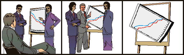
1. Introduction
The past year we have seen some surprising turns in the world
economy. After a couple of cheerful years of so called New
Economy, stockbrokers were
issuing warnings of an expected downturn. And down we went.
But what happened then? Enron. And with
them almost overnight one of the worlds biggest auditing firms
Andersen simply ceased to exist. Enron had been supporting the
Republicans. And when I say supporting, I don't mean that the
employees used to cheer for the politicians during congress meetings
- no, you know what kind of supporting I mean. But when shortly after
that the Democratic Party backing WorldCom announced that they had
accounted for 7 billion of dollars that didn't have any counterpart
in Real World dollars, even Mr W got a bit upset. "From now on
any dot-com that funds the Democrats will have to report their
earnings truthfully, or else..." he declared.
So with the threath of facing 20
years of jail - merciful as he is, W didn't, at least yet, threaten
with the chair he has back home in Texas - accountants all over the
USA are now faced with the dull prospects of only accounting for
money that actually exists, as we used to do back in the good Old
Economy days. But that of
course poses some new challenges. "How are we going to make the
investors like us, if we have to tell them the truth?" some
might ask. One might even argue that if this kind of creative
accounting had not been allowed during the last years, we might never
have seen any of the New Economy that, after all, was a happy time
wasn't it?
But maybe all is not lost, my friends. Even if the actual numbers
will now have to be truthful, there still are some tricks a dot-com
might turn to. This paper discusses the art of making charts that
lie, while being technically correct. Accountants all over the world
will be delighted to find, that it's possible to make a financial
report that at the same time is 100% correct but also looks good. It
is kind of like painting pretty pictures next to a horrible story.
The logic of using such misleading graphics in forthcoming financial
reports would therefore be:
When given a choice, most readers will rather look at the
colorful graphics of a report than the actual numbers presented in a
dull table.
It is possible to make such graphics look much better than
the underlying statistics, while at the same time preserving their
integrity - or shall we say at least technical correctness.
In the following pages we will learn some techniques, to make such
charts. Each technique is presented separately, as a kind of building
block. It's left to the reader to combine suitable techniques in
order to achieve the best possible results for his financial report.
After presenting the various techniques of deception, some real world
examples are also investigated.
This paper was written as part
of a course in Information visualization, at Helsinki University of
Technology. Most ideas are drawn from or have at least been inspired
by the two coursebooks"The Visual display of quantitative
information"[2] by Edward Tufte and "Information
visualization: perception for design"[3] by Colin Ware. Most
basic tricks have their roots in Tufte while the more advanced tricks
that play with the shortcomings in the psychology of our vision are
from Ware.
It is my humble wish that it may help US accountants to save the
world economy.
Question:
(totally unrelated to the topic of the paper)
If the financial boost during the so called New Economy was only a
boost on paper - that is, none of the fuzz actually existed as real
money - is it then also true, that the current depression is also
only a depression on paper, since there never really was any money to
be lost?
2. Basic concepts and tools
Before we start looking into the various techniques, let's start
with introducing a couple of concepts, that will be used in
evaluating the techniques.
The Lie Factor
The lie factor is a concept that is introduced in Edward
Tuftes book "The Visual display of quantitative information"[2].
The idea of the lie factor is to express in numbers, how much a
graphic deviates from the actual data it should represent. The
formula for calculating the lie factor is thus:
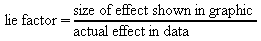 (1)
(1)
For instance, if we have a simple table with two numbers:
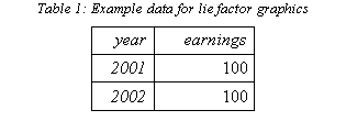
The basic bar chart would then become:
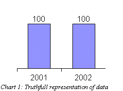
Since this is an accurate representation of the data,
the lie factor equals one. On the other hand, the artist in charge of
making charts might for some weird reason decide to "emphasize"
the second bar in the chart:
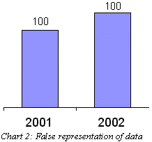
Now the second bar is much taller than the first one,
even though both claim to represent the value 100. If we assume that
the size of the first bar is correct we can now calculate the lie
factor for year 2002:
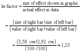 (2)
(2)
A good rule of thumb to remember: Truthful charts
always have a lie factor of one, whereas any other lie factor
indicates a misrepresentation.
The Psychological Lie Factor
As we shall see, it is quite feasible to make charts that have a
lie factor of one, but still manage to fool the eye into seeing
something that wasn't in the data. These charts are technically
correct but they lie anyway. In these cases we will talk about a
psychological lie factor, which would be defined as something
like:
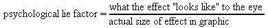 (3)
(3)
The "looks like" part will often only be a
subjective estimate, but nevertheless this will be a useful concept
in evaluating how much a graphic manages to fool the viewer.
The Thumbs rating
Finally we will rate each technique with a thumbs-up or
thumbs-down figure, possibly with handcuffs added.
Table
2: The Thumbs rating
This rating will characterize how the technique relates to the two
questions:
In terms of the lie factors, the artist will typically avoid
handcuffs and jail, if the lie factor is one. The thumbs up rating on
the other hand, will be given to graphics where either the lie factor
or the psychological lie factor is not equal to one.
Another funny side note:
It is perhaps worth noting, that what we normally would regard as a
good graphic, would here receive a thumbs down rating, because of the
fact that it represents the data as truthfully as possible. In this
essay, that is not a wanted feature.
On the other hand, such a graphic would avoid the handcuffs, so
honesty is not that bad after all.
3. Manipulating the axes
The first set of techniques, is based on manipulating the axes to
better suit our needs. Let's go straight to it.
Pick your own interval
To demonstrate these techniques, let's play with some figures from
our favourite stockmarket company Nokia.
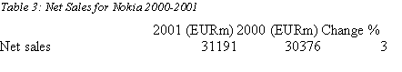
In an ordinary graphic, these numbers become two equally heigh
bars:
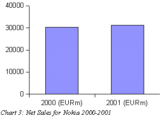
The bars look similar. Even though Nokia did quite well,
increasing it's sales by 3%, it isn't obvius from the chart. It's
probably okay if we emphasize that growth just a little:
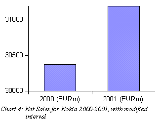
Who says that the scale has to start from zero? Nothing important
happens before 30 billion euros anyway. With focusing on the range 30
000 - 31 200 we have made year 2001 stand out as a major year of
growth, instead of being practically equal to it's predecessor, as
the first chart might have led us to think.
 So
what about the lie factors? Technically there is nothing wrong in
what we have done. The numbers on the Y-axis are there, and the bars
are exactly the height of the values they are supposed to represent.
The chart comes out with a lie factor of one! When comparing the two
charts above, it is however obvious, that the second one is more
positive than the first one. Even though we can clearly see the
correct numbers to the left, our eyes tell us that the bar to the
right is 3,16 times higher than it's left companion. The
psychological lie factor will therefore be 3,16/0,03 = 105!
So
what about the lie factors? Technically there is nothing wrong in
what we have done. The numbers on the Y-axis are there, and the bars
are exactly the height of the values they are supposed to represent.
The chart comes out with a lie factor of one! When comparing the two
charts above, it is however obvious, that the second one is more
positive than the first one. Even though we can clearly see the
correct numbers to the left, our eyes tell us that the bar to the
right is 3,16 times higher than it's left companion. The
psychological lie factor will therefore be 3,16/0,03 = 105!
The graph will therefore be awarded a definitive thumps-up and no
handcuffs! A simple but powerful technique, that is in fact often
used in advertising.
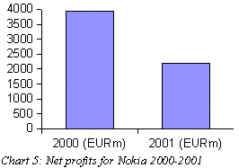
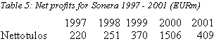
De-emphasize with a large interval and stretching
The previous technique has one major drawback. It can only be used
to over-emphasize data that actually exist. If sales had gone down
during 2001, we could not have saved ourselves using this technique.
The same technique can however be reversed. We can choose an overly
broad interval. That will not turn profits into losses, but it will
de-emphasize the downward trend into something that seems to be very
flat. This could have been useful in reporting Nokias net profits for
the same time period:
Table
4: Net profits for Nokia 2000-2001
|
|
2000 (EURm)
|
2001 (EURm)
|
Change %
|
|
Net profit
|
3938
|
2200
|
-44
|
A decline by almost half will not look good:
But with a different scale it's not that bad:
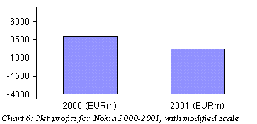
To hide the decline we have streched the x-axis which
made the bars thicker and thus helps de-emphasize their height.
But hey, wait a minute! Why do those bars start from a
negative 4000? There is really no good reason, nor even a mediocre
excuse. The only reason is, that it was really hard to get those bars
equally high. And even if I cheated a little, the right one still
looks shorter than the left one.
 So
even if the chart is still technically correct, the cheating is too
obvious and what's even worse, the decline in profits is still
visible. This technique might be handy in some cases, but to cover up
a decline by almost 50% is too much to ask. We are forced to give a
negative verdict: thumbs down and caught for cheating!
So
even if the chart is still technically correct, the cheating is too
obvious and what's even worse, the decline in profits is still
visible. This technique might be handy in some cases, but to cover up
a decline by almost 50% is too much to ask. We are forced to give a
negative verdict: thumbs down and caught for cheating!
When to use a negative scale
There are situations, when negative numbers might be excused.
Suppose Nokias profits continue to decline, and turn into losses in
2002. (At the moment of writing this doesn't seem very likely, but
let's imagine they do.) Let's say that for 2002, Nokia would report a
loss off 500 million euros:
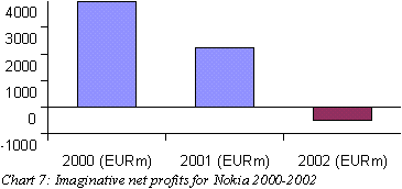
Declining profits is bad enough, but if a company starts to lose
money it's even worse. The worst thing to do is to start emphasizing
that with red color! This might be a situation, where it is tempting
to drop the x-axis downward, so that all bars at least point up:
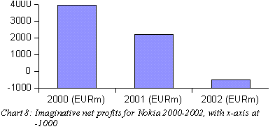
 We
won't go into the discussion about the lie factors for this graph
(I'm trying to avoid the need to introduce the concept of a negative
lie factor), but it is obvious that it makes a difference whether
something points up or down. Whether we are still on the safe side
legally is a tough call. Now when we actually have negative values in
our data, it might be okay to have a negative axis. The judge might
let it pass, but I'll leave the handcuffs on just to be safe.
We
won't go into the discussion about the lie factors for this graph
(I'm trying to avoid the need to introduce the concept of a negative
lie factor), but it is obvious that it makes a difference whether
something points up or down. Whether we are still on the safe side
legally is a tough call. Now when we actually have negative values in
our data, it might be okay to have a negative axis. The judge might
let it pass, but I'll leave the handcuffs on just to be safe.
Picking the most suitable scale
Above we have used techniques where we pick a suitable begin and
endpoint for our axes and also stretch them according to our needs.
One last thing to consider, is the scale itself. If you've paid
attention in a statistics class, or even explored your spreadsheet
application (Excel), you might have heard about something called a
logarithmic scale. A logarithmic scale is typically used to present
data, that grows or otherwise changes exponentially. It has an effect
of emphasizing the variations in small values (from 1 to 10) and and
de-emphasizing the variations of larger values (100 to 1000).
Consider the development of the Nokia stock over the past 5 years:
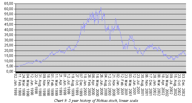
The curve seems to be rather smooth until the end of 1999 when it
suddenly starts rising. During 2000 the ups and downs are extreme,
but towards 2002 the curve smoothens again. The New Economy bubble is
evident. Or is it...
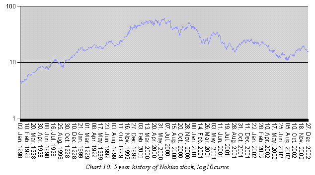
What bubble? Sure the stocks seem to rise during 1998, but other
than that this curve seems very smooth. What's happening here?
The former chart shows the development of the literal value of the
stock. The latter chart on the other hand, shows the relative
development. Let's say that Nokia drops 10% during one day and see
what it looks like on the first graph. If the drop happens in January
1998, it's likely to go almost unnoticed in the graph, since the
change is less than 0,5$. But if it happens during January 2001 it
will certainly be noticed, because now it's more than one interval on
the y-axis.
On the latter chart both of these 10%
drops, as well as any other 10% change, would be of exactly the same
size. That's because the logaritmic size shows relative changes,
while the linear scale shows absolute changes.
So, what does all of this mean? The
former chart is what we recognise from the economic news and press.
But in times like these, why not use the second chart? "I
don't know about you guys, but we here at Nokia have certainly not
seen any bubbles burst. Our curve is as smooth as ever!"
 So
what about the handcuffs? Again we are not doing anything wrong,
altough you could argue that the log10 scale means a psychological
lie factor of 10. In any case the scientists do it all the time, so
it must not only be right, it's probably also intelligent and cool!
The only dishonesty is simply that people are used to seeing the
first chart. Thumps up and no handcuffs!
So
what about the handcuffs? Again we are not doing anything wrong,
altough you could argue that the log10 scale means a psychological
lie factor of 10. In any case the scientists do it all the time, so
it must not only be right, it's probably also intelligent and cool!
The only dishonesty is simply that people are used to seeing the
first chart. Thumps up and no handcuffs!
Real World example: Yahoo!'s daily stock quotes
The problem with picking a suitable scale and interval for the
axis, is that you always have to pick something. What is right and
what is cheating is not always easy to say.
Take this graph from Yahoo as an example. It's a curve of one days
exchange rates for Nokia:
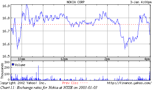
At first sight it looks like Nokia had a rough day. But then you
look at the scale of the y-axis and realise that all variation was
within 35 cents and what's even more, at the end of the day we are
pretty much back to the same level where we started in the morning. I
don't know much about the stock market and it could be that 35 cents
is very significant but at least it's still much less than the
interval Nokia had the previous day, which was almost a dollar:
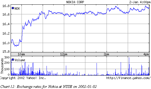
Yet the curves look very much alike at first sight.
What's happening here? Yahoo scales each graph, so that only
what's significant will show. That is a valid excuse, it would not
make much sense to have a constant scale for all days and different
companies, since some curves would surely not fit on the screen at
times of turmoil while others would look like a dead straight line.
Scaling into what's significant is the best option if we want to
maximize the amount of information in the graph.
 But
there is still a pitfall. This approach guarantees that all charts
will look like there was a storm at the stock exchange, even when the
curve is in fact very flat. A thumbs up to Yahoo for making sure that
every day on the stock market looks exciting. And no handcuffs for
the (very much so) valid excuse.
But
there is still a pitfall. This approach guarantees that all charts
will look like there was a storm at the stock exchange, even when the
curve is in fact very flat. A thumbs up to Yahoo for making sure that
every day on the stock market looks exciting. And no handcuffs for
the (very much so) valid excuse.
4. Artistry
One obvious way to achieve our goal of beautifying the actual
data, is straigthforward: Simply draw a picture that looks the way
you want it. This is the category that Tufte calls "the Pravda
school".

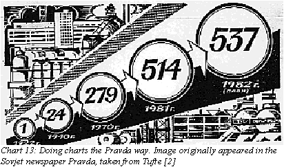
I think the Sovjet artist definately deserves a thumbs up!
The graphics in this section should be accompanied with the
subtitle "all characters and events in this movie are fictious,
and any resemblance to actual persons or events is purely random".
Obviously, all charts in this chapter will have a thumbs rating with
handcuffs on. That follows directly from the definition.
The magnifying glass
A typical thing to do, which at first thought sounds like
something perfectly normal, is to emphasize this years figures. Let's
look at our second most favorite stock company: Sonera.
Talk about technology bubble! Less than a third is left from the
profits of 2000. But don't worry, zooming in on 2001, it doesn't look
all that bad after all:
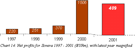
 This
is the wet dream of Enron accountants! Just stretch the bar in both
directions until it's big enough. The slope in the bottom line
provides a hint for the viewer, that we have broken the scale at this
point and moved in for "a closer look". This is a standard
way of drawing in perspective, so the reader might even think this is
ok. But it's not. The lie factor for this graph is
This
is the wet dream of Enron accountants! Just stretch the bar in both
directions until it's big enough. The slope in the bottom line
provides a hint for the viewer, that we have broken the scale at this
point and moved in for "a closer look". This is a standard
way of drawing in perspective, so the reader might even think this is
ok. But it's not. The lie factor for this graph is
(2,75 cm / 409
EURm) / (2,95 cm / 1506 EURm) = 3,4
and the stretching of the
x-axis and the brighter red add some more for a psychological lie
factor. Click click, on with the handcuffs.
The artistry category could be expanded by many more masterpieces.
In fact once the artist gets going, the charts will be much more
decorative. But the idea will always be the same as in this basic bar
chart.
5. Confusing dimensions
One type of artistry that deserves to be given it's own category,
is the play with dimensions.
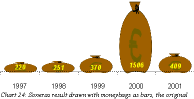
Is this 1d or 2d?
What about exchanging the dull bars with something more
interesting? Like a bag of money, for instance. Here are the same
results from Sonera again:
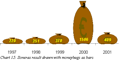
It's the same bar chart but fancier. What we are doing here is
playing with the viewers mind. How much money does the big bag
represent? It's hard to tell really. The bag looks tall, but on the
other hand it looks slim. A slim year 2000? What if we make both
height and width dependent on the profit:
Whoa! That year 2000 really was something after all! Note that the
bags are exactly as tall as in the first chart, but the effect is
rather different this time.
Let's try some other variants. If we really want to have
2-dimensional moneybags, it would be more correct if the area
of each bag represents the value, rather than the radius:
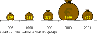
Suddenly year 2000 doesn't look that different from the others.
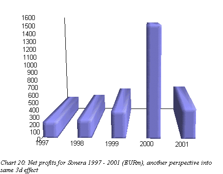
Or is it 3d?
But since we are dealing with moneybags, shouldn't the size of the
bag reflect the amount of money that's in it? Or if we put it in the
language of geometry, shouldn't the value be relative to the volume
of the bag? Let's try that too:
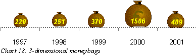
As you might have guessed, the bag with 1506 million euros shrinks
even further. That we have added a 3-dimensional lighting effect
doesn't help, the 1506 million euros look awfully small.
Looking at the above charts, we can conclude that playing with
dimensions greatly affects what the viewer sees in a graphic.
So what about the lie factors? The thing is, all charts are
correct in their own way. The problem is to know from which
dimensions the variables should be read. So it's really up to the
viewer. To make an extreme example, if we interpret the bags in the
second chart as true 3-dimensional bags, we get a lie factor of
...which must be some kind of a record!
But as a more general summary, we can conclude that
The first chart with moneybags is the one most like bar
charts. It confuses the viewer, but whether it emphasizes or
de-emphasizes things isn't immediately clear and may depend on the
data and type of image used. To me it looks like this chart is
emphasizing the loads of money made in 2000, but that could be
subjective.
The second chart is obviously an exaggeration. In fact,
because we have used the same variable in two dimensions, it's
almost knocking on the border of being illegal, but we'll judge it
still being on the safe side.
Using true 2d and especially 3d images, is a great way of
smoothening.Year 2000 is greatly de-emphasized.
Personally, I find the true 2d chart to be the most intuitive
one, and thus most truthful, but the first chart is probably the one
to be generally acceptable, because it is basically a normal bar
chart with pictures. The first chart is also most likely to be seen
in artistic charts, because both Excel and OpenOffice contain a
feature to use images as bars.
In
short, a great package of tools for both growing and shrinking things
as needed. And all of it completely on the legal side!
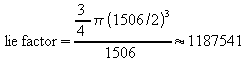
A deceitful perspective
While we are at the subject of 3d imagery, let's delve into two
other useful techniques in the same category. Look at the same Sonera
bars once more, now with a 3d effect courtesy of OpenOffice Calc:
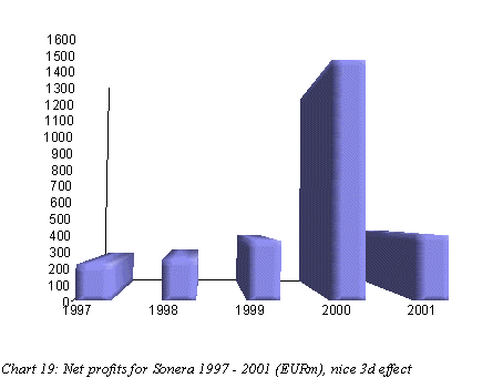
Those OpenOffice people have done a nice job with their 3d
effects. It's even possible to rotate the chart so that you get
another perspective. Here is another chart that is almost like the
one above:
So, what has changed? In the first chart, the perspective is such
that we are looking at the bars from a very low viewpoint. In the
first graph, it is as if we are about the same height as the four low
bars, while the tall bar of year 2000 is way higher than anything
else. In the second version we are looking down on everything, and
also the bar for 2000 looks shorter than us.
 And
the judgement for this technique? There is a difference, but one bar
that is three times the height of everything else will stand out no
matter how you twist it. Having seen the moneybag tricks, we are not
impressed with this anymore. In a very tight situation this technique
could be used to give a psychological hint of what should be
considered high and what low. But we will give it a thumbs down. No
lying in this technique though, so there is no harm in using it if
you think it does something for you.
And
the judgement for this technique? There is a difference, but one bar
that is three times the height of everything else will stand out no
matter how you twist it. Having seen the moneybag tricks, we are not
impressed with this anymore. In a very tight situation this technique
could be used to give a psychological hint of what should be
considered high and what low. But we will give it a thumbs down. No
lying in this technique though, so there is no harm in using it if
you think it does something for you.
A background with perspective
For our last trick in this category, let's switch back to the
numbers from Nokia we already had in the beginning. You have already
seen them, but here they are again:
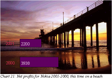
Ok, so the bar for 2001 might still look shorter, but the image in
the background does soften the drop a little bit. The effect comes
from the perspective in the picture. If we interpret the bars as
being part of the landscape, it would seem that the lower bar is
short but close to us, while the upper bar is very big but distant.
If interpreted like that, we could use the boardwalk to estimate that
a psychological lie factor is something between 4 and 5. (The lower
bar would have to be 3 times bigger just to match the upper in
reaching the boardwalk.)
Unfortunately however (for Enrons accountants that is) most people
are not so stupid as to fall for this trick. Most of us simply ignore
the background and interpret the bars correctly, as if the background
was not there at all:
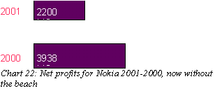
Even
if we couldn't make the shorter bar look taller, the perspective in
the background does bend reality a little, so I think it's worth a
thumbs up.
I don't know if you noticed, but I had to cheat a little again. In
order for the perspective thing to work at all, I had to make the
upper bar thinner than the lower. Without this adjustment, the trick
simply doesn't work. Even if the length of the bars is still intact,
tampering with the bars in this way is in my opinion going too far.
So we put the handcuffs on again.
6. Distractions
3 dimensional backgrounds is not the only irrelevant thing we can
add to our charts to confuse the reader. The ultimate trick in the
distractions category - only to be used by the truly desperate -
would of course be adding not only a beach but also a bunch of
topless chicks! Or perhaps that would seem too desperate?
A suitable placement for the labels
In any case, I don't have pictures of topless women (sure, and you
couldn't find any on the Internet either...) so I'll show you a
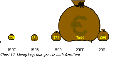
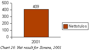
different trick. You have seen these moneybags from Sonera:
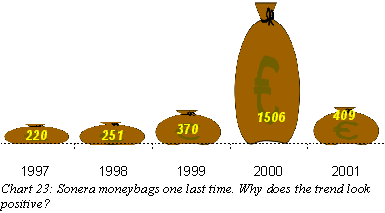
The bars/bags are exactly the same, but is there a feeling of a
positive trend in this picture, that wasn't there in the original:
The difference is, in the original the labels that tell
us the actual value of each year are all down at the bottom. In the
modified version above, There is an upward trend - the last value of
409 is actually higher than it's predecessor 1506.
There is no motivation in the data for placing the
labels as I did, but it doesn't feel completely wrong to do it
either. And is the viewer confused? The bags are still there, and
it's obvious that the last bag is much shorter than it's predecessor.
But when reading the values, the reader scans the numbers from left
to right and the eyballs follow the numbers making a slight upward
tilt, giving a subtle feeling of something going upward - a positive
trend.
But it's only a subtle feeling and in fact the reason
why I chose the moneybag chart for this trick is that simple
rectangular bars would have been strong enough to cancel that effect.
The height of a rectangular bar is something very obvious and in
addition it's something we are all very used to interpret. The
moneybags are not as easy to interpret and while the reader is
processing this new type of chart in his mind the eyeballs start
making the upward tilt. In short, an unclear graphic gives more
weight to the effect of placing the labels intentionally wrong.
If you are still not convinced, consider this variant
where the values are placed at the top of each bag:
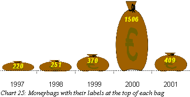
 When
reading the numbers, you have to considerably lift your eyes to reach
the high number of 1506, leaving no doubt that it's way bigger than
the other ones. It's obvious from these three charts that the placing
of labels makes a difference (in fact it's the reason why I chose to
move the labels to the bottom in the 2d/3d experiments). If you want
to emphasize year 2000, use the last version. If you want to create a
feeling of a positive trend, use the first one.
When
reading the numbers, you have to considerably lift your eyes to reach
the high number of 1506, leaving no doubt that it's way bigger than
the other ones. It's obvious from these three charts that the placing
of labels makes a difference (in fact it's the reason why I chose to
move the labels to the bottom in the 2d/3d experiments). If you want
to emphasize year 2000, use the last version. If you want to create a
feeling of a positive trend, use the first one.
No lying involved, the lie factor is an even one. It's
hard to give a numeral estimate on a psychological lie factor, but
it's obvious that the trick works. And another reason to give a
thumbs up: this trick will not upset your mom and dad. Stay clear of
naked women as long as possible!
7. Simply hide the ugly details
In this category we will examine techniques that don't distort
anything. We simply hide the things we don't want to show. And there
is more than one way to do it.
No context
An important property of a chart is to have enough context to be
able to interpret the chart meaningfully. But in this essay we don't
want the viewers to interpret anything meaningfully. Suppose we are
a bit embarrased by the two-thirds decline in profits for Sonera. Why
don't we just cut out the possibility to do any comparison:
Okay, that looks a bit ridiculous, I just wanted to make my point.
Some other data would probably have fitted this technique better. For
instance we could break up the 2001 result into each quarter and then
we would have had four bars to show the same data as above. Our
readers would be satisfied with so many bars to look at and no one
would remember what happened in 2000.
Charts that suit this technique very well are lines and curves of
all kind. Do you remember the boom and bust in the chart of Nokia's
exchange rates over the last 5 years. We already made that bubble
disappear once, but I can assure you that there really was no bubble.
Those mobile companies are a safe and solid bet on the stock market:
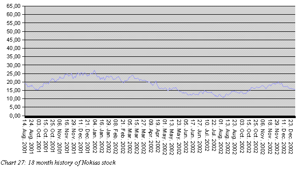
 Bar
charts with only one bar is going too far, but used with the
appropriate amount of good taste and careful consideration, this
technique will be your friend in many tough situations. And best of
all, it's all 100% true.
Bar
charts with only one bar is going too far, but used with the
appropriate amount of good taste and careful consideration, this
technique will be your friend in many tough situations. And best of
all, it's all 100% true.
Or too much
The other way to go, is to provide more information than anyone
can take down:
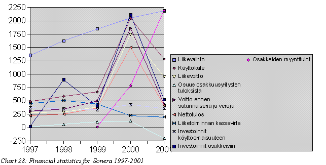
Also known as the "They will never know what hit them"
technique. Lucky for us, the turnover has increased even in 2001,
providing for a steadily growing curve on top. Since you can't really
figure what's going on with the other lines, this will give an
overall impression of "something was going up, even if I
couldn't tell what it was".
The spagetti that results from the 9 other lines can also be
interpreted positively: "Lot's of activity in this telecom".
Or in more layman terms: "Those guys at Sonera are really some
hard workers." (Because they have produced so many curves that
just looking at them makes me tired.)
 The
only downside with these techniques, is that if you make things too
unreadable, the reader might fall back to reading the actual numbers
in the financial statement again and we were trying to use graphics
to prevent them from doing that.
The
only downside with these techniques, is that if you make things too
unreadable, the reader might fall back to reading the actual numbers
in the financial statement again and we were trying to use graphics
to prevent them from doing that.
Another useful and 100% truthful technique. Just don't overdo it
or you'll lose everything.
Real World Example: Oikotie ad in Helsingin
Sanomat
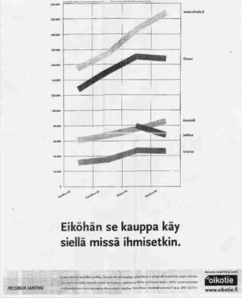
Chart
29: Helsingin Sanomat advertising for it's Oikotie website. Other
websites in the graph are "Etuovi", "Autotalli",
"Jobline", "Uranus".[1]
This full page ad appeared in the daily newspaper Helsingin
Sanomat on 12th November 2002. The graph shows the development of
visitors per month for some Finnish websites, where users can sell or
buy apartments, cars and announce job opportunities. The chart is
intresting to us, because it actually uses several of the techniques
we have just presented.
Firstly the fact that this is a full page ad, provides for some
really phenominal stretching of the Y-axis. Not only is
www.oikotie.fi leading the race, it's doing that with a margin of 7
centimeters to it's closest competitor "Etuovi" and a
whopping 27 centimeters above level zero!
But the chart also employs the "Not enough context"
technique, which is a very common thing to do in advertising. I mean
you wouldn't buy such an expensive ad if it weren't to tell some
carefully selected positive facts. In this case we are faced with a
timeseries with only four datapoints, covering a period of only four
months, June - September 2002. If we also take into account that in
Finland this is the time for everyones holidays, this data would
probably not be worth much in a more serious study. But as an
advertisement it's great.
But even more engineous than the scarce datapoints, is the fact
that we are not comparing apples to apples here. The slogan below the
chart says: "Guess the business is where the people is".
Now Oikotie is a service for buying and selling apartments, cars and
jobs. But the names of the other websites indicate, that they are
doing only one of the three: Etuovi (front door) is probably for
trading apartments, while Autotalli (garage) obviously is about cars
and Jobline... well you get the picture.
 So
Oikotie may have the largest number of visitors alltogether. But what
if I want to buy a car? This chart doesn't seem to tell me what the
best place to do that is. While Oikotie on top probably is not the
worst of choices, we don't know whether it's a very good car trading
place, or whether most of the traffic there is actually about
apartments. Anyway, following the logic of the slogan, we could then
continue to conclude, that the second best place to sell your car is
the "front door" service, which obviously cannot be true.
So
Oikotie may have the largest number of visitors alltogether. But what
if I want to buy a car? This chart doesn't seem to tell me what the
best place to do that is. While Oikotie on top probably is not the
worst of choices, we don't know whether it's a very good car trading
place, or whether most of the traffic there is actually about
apartments. Anyway, following the logic of the slogan, we could then
continue to conclude, that the second best place to sell your car is
the "front door" service, which obviously cannot be true.
Thus this chart seems to actually mix in too much and too little
context at the same time! It's a definite thumbs up.
Optical illusions
So let's move to our final category, optical illusions. This is
the category of real magic, where our eyes start to see things that
don't exist at all.
Grayscale tricks
Our eyes are used to adapting to different levels of illumination.
We have adequate vision in an almost dark room and on the other hand
we have no problem adjusting to the brightest summer day. But this
capability can also be abused. Even when you know it's a fact, it's
difficult to admit that the four bars in the next picture are of the
same level of gray:
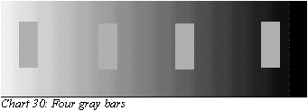
No matter how hard you try, it will always look as if the left bar
is darker than the right. This is because our eyes immediately adjust
to the background, and thus the same bar will look different against
different backgrounds.
So, how can we use this to create more deceitful charts? Actually,
within our topic, it's kind of difficult. The idea in itself is
simple, you could use an image in the background (like we did with
the beach and perspectives) where suitable areas would be darker or
lighter. But the problem is, to use this technique we would have to
encode our datavalues into grayscales. Now that might be possible if
we were drawing maps, but for financial data it would be rather
exotic:
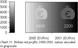
The unorthodox encoding is likely to confuse the viewer so much,
that the trick itself is completely wasted. I myself have problems
understanding what I'm trying to do with that picture!
But we can use this effect, known as crispening, in another kind
of trick. Consider Nokia's net profits once more. A basic bar chart,
but colored with grayscale gradients:
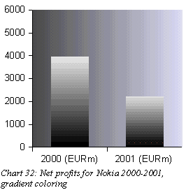
The shade of blue is added simbly because it looks good. But what
are we trying to do? The size of the bars is intact and the height of
the bars is also perceived correctly. But if I were to ask you to
point out the 50% height of both bars, the varying background will
add some challenge.
In our rational minds, we try to cut the bars in two halves, but
our eyes see something else. Our eyes easily fixate on the spots
where the gray shade of the bar equals the gray of the background.
Approximately these spots are:
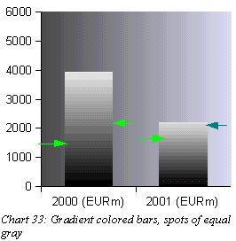
If you previously felt that the right bar was mysteriously
strongly rising even though you knew
it's the shorter one, this was why. The spots where its' brightness
equals the background are higher than corresponding spots on the left
bar, giving a feeling that somehow - although it's still shorter - it
is rising very steeply. Another thing that adds to the effect is that
on both bars the spot his a bit higher on the right side than the
left, creating a feeling of an "upward trend". This comes
from the fact that the background lightens towards right, and the
bars are quite wide so the lighting is different on the left and
right sides.
And
how should we rate this? I must say I was expecting more from this.
Maybe it's just that I don't know how to do it correctly, but the
effect is not as powerful as I had hoped. But it's doing something
isn't it? Maybe I'm just imagining something that isn't there at all,
but I'm inclined to give it a very small thumbs up for good effort if
nothing else.
Texture variations
Another effect where our eyes lie to us, is variations in texture.
An example would be the picture below:
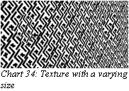
The texture seems to become smaller (or thicker)
towards right. But there are two circular areas that differ from this
overall pattern. It seems like at the left there is an area with
quite a small texture while the area at the right has a larger
texture.
This is in fact a trick similar to the four identical
gray bars that seem to differ in brightness. The two circles in the
picture are completely identical. Their texture size just seems to be
different, because our eyes get confused when the background is not
constant.
So, could this effect be useful? Let's try with the net
profits from Nokia again:
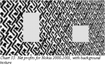
Not impressed? Me neither. But the background seems to
have some kind of effect, if you compare it to what the plain bars
would have looked like:
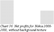
In any case this is not exactly what we were heading
for anyway. If we compare with the original example, also the bars
should be texturized:
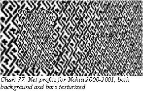
 The
only real effect seems to be that the bars, especially the right one,
become hard to spot at all. Once you get a hold on them, they look
the same size as always.
The
only real effect seems to be that the bars, especially the right one,
become hard to spot at all. Once you get a hold on them, they look
the same size as always.
Ruling: We are not impressed. Even the grayscale tricks
were better than this.
9. Summary
What have we seen? A plethora of techniques that can be used to
distort reality in charts. Some were really astonishing, while others
failed miserably. Most techniques seem to be useful in either
emphasizing a positive trend that actually exists, or de-emphasizing
negative trends. It proved to be difficult to find techniques that
could actually make losses look like gains. Closest to actually
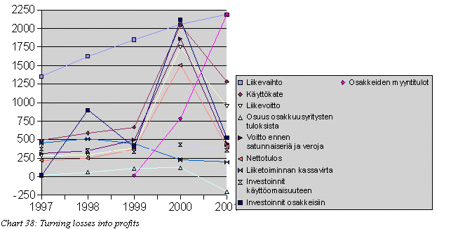
turning reality upside down, was chart 28 in the "Too much
context" category. There we needed one good looking curve under
which to hide all the negative ones:
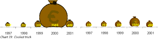
The coolest effect in my opinion was the play with the moneybags
in different dimensions. It's still hard to accept that these charts
actually show the same thing:
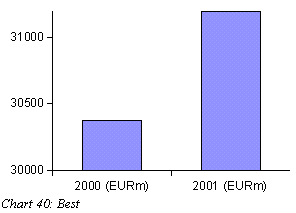
But the prize for best overall effect goes to chart 4 in "Pick
your own scale". The jury especially praises the technique for
it's large flexibility and simplicity. It is very easy to implement,
fits a large range of different data and gives you flexibility in how
far ou want to go:
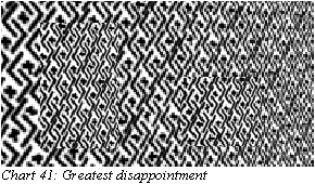
Finally the prize for "Greatest disappointment" is
awarded the "Optical illusions" category. Maybe it was my
inexcperience with such graphics that was the problem, but
nevertheless: we had great expectations and saw absolutely nothing:
1:
Edward R. Tufte, The visual display of quantitative information,
1983
2:
Helsingin Sanomat, "Oikotie" advertisement, 2002-11-12
3:
Colin Ware, Information visualization: perception for design, 2000
Table
1: Example data for lie factor graphics 4
Table
2: The Thumbs rating 6
Table
3: Net Sales for Nokia 2000-2001 6
Table
4: Net profits for Nokia 2000-2001 8
Table
5: Net profits for Sonera 1997 - 2001 (EURm) 13
Chart
1: Truthfull representation of data 4
Chart
2: False representation of data 5
Chart
3: Net Sales for Nokia 2000-2001 7
Chart
4: Net Sales for Nokia 2000-2001, with modified interval 7
Chart
5: Net profits for Nokia 2000-2001 8
Chart
6: Net profits for Nokia 2000-2001, with modified scale 8
Chart
7: Imaginative net profits for Nokia 2000-2002 9
Chart
8: Imaginative net profits for Nokia 2000-2002, with x-axis at
-1000 9
Chart
9: 5 year history of Nokias stock, linear scale 10
Chart
10: 5 year history of Nokias stock, log10 curve 10
Chart
11: Exchange rates for Nokia at NYSE on 2003-01-03 11
Chart
12: Exchange rates for Nokia at NYSE on 2002-01-02 12
Chart
13: Doing charts the Pravda way. Image originally appeared in the
Sovjet newspaper Pravda, taken from Tufte [1] 12
Chart
14: Net profits for Sonera 1997 - 2001 (EURm), with latest year
magnified 13
Chart
15: Soneras result drawn with moneybags as bars 14
Chart
16: Moneybags that grow in both directions 14
Chart
17: True 2-dimensional moneybags 14
Chart
18: 3-dimensional moneybags 14
Chart
19: Net profits for Sonera 1997 - 2001 (EURm), nice 3d effect 16
Chart
20: Net profits for Sonera 1997 - 2001 (EURm), another perspective
into same 3d effect 16
Chart
21: Net profits for Nokia 2001-2000, this time on a beach 17
Chart
22: Net profits for Nokia 2001-2000, now without the beach 17
Chart
23: Sonera moneybags one last time. Why does the trend look
positive? 18
Chart
24: Soneras result drawn with moneybags as bars, the original 18
Chart
25: Moneybags with their labels at the top of each bag 19
Chart
26: Net result for Sonera, 2001 19
Chart
27: 18 month history of Nokias stock 20
Chart
28: Financial statistics for Sonera 1997-2001 20
Chart
29: Helsingin Sanomat advertising for it's Oikotie website. Other
websites in the graph are "Etuovi", "Autotalli",
"Jobline", "Uranus".[2] 21
Chart
30: Four gray bars 22
Chart
31: Nokias net profits 2000-2001, values encoded in grayscale 22
Chart
32: Net profits for Nokia 2000-2001, gradient coloring 23
Chart
33: Gradient colored bars, spots of equal gray 23
Chart
34: Texture with a varying size 24
Chart
35: Net profits for Nokia 2000-2001, with background texture 24
Chart
36: Net profits for Nokia 2000-2001, without background texture 24
Chart
37: Net profits for Nokia 2000-2001, both background and bars
texturized 25
Chart
38: Turning losses into profits 25
Chart
39: Coolest trick 26
Chart
40: Best 26
Chart
41: Greatest disappointment 26